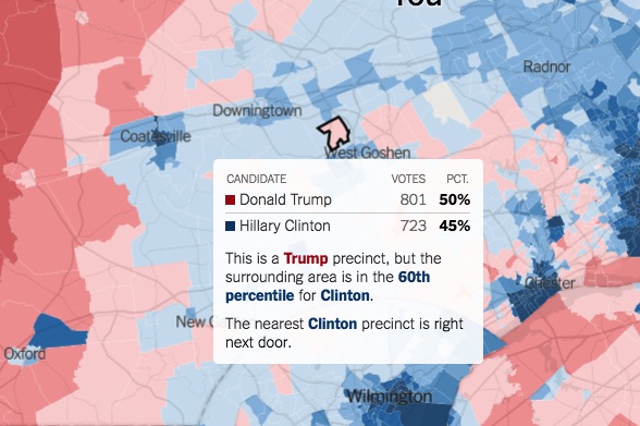
NY Times Interactive Map Shows Presidential Election Results by Voting Precinct

The New York Times has published an interactive map that explores the last presidential election by voting precinct.
The map expands the already available results from 3,100 counties to more than 168,000 precincts, and now provides the highest level of detail available.
The map also highlights several oddities, including the fact that many voters live in an electoral bubble. The map shows that more than one in five voters lived in a precinct where at least 80 percent of the vote went to either Hillary Clinton or Donald Trump.
[uam_ad id=”58459″]
Advertisement
The map shows that Philadelphia itself voted nearly uniformly blue, with several precincts voting 100 percent for Hillary.
Most of the surrounding suburbs, including Chester and Delaware counties, also voted for Hillary, but by a much smaller margin. The map also gives an excellent overview of how divided the votes were in local regions, going from deep blue to deep red within precincts in a single county.
For example, in both Chester and Delaware counties, the precincts nearest to urban centers voted blue, while those further out voted red.
See how your precinct voted in The New York Times by clicking here.
[uam_ad id=”71915″]
Connect With Your Community
Subscribe to stay informed!
"*" indicates required fields


![95000-1023_ACJ_BannerAd[1]](https://vista.today/wp-content/uploads/2023/03/95000-1023_ACJ_BannerAd1.jpg)


